


Google has changed how Reading Mode looks and behaves in Chrome Canary on desktop. The page now looks calmer, cleaner, and more focused on reading.
Google started testing immersive reading mode, including line focus, in the Chrome Canary version earlier. The aim was to reduce visible browser UI and make the page feel like a dedicated reading space.
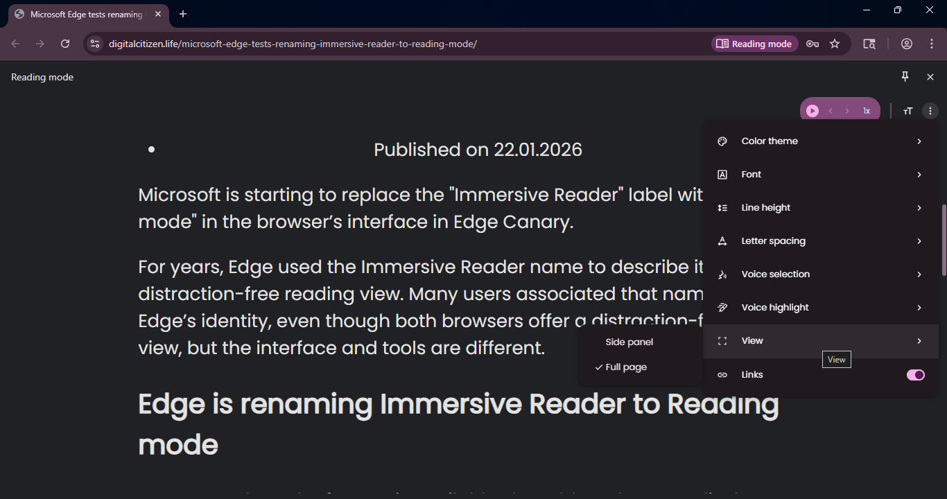
Microsoft Edge already offers a similar style in its Reading Mode. Chrome is now moving in the same direction, where the page becomes the main space for reading rather than the browser frame.
Earlier, Reading Mode still felt like a page inside a browser, with a noticeable top bar and a boxed layout. Now, the interface fades into the background and the view looks closer to a reading app than a website.
The background color you choose now stretches across the entire screen, not just the text area. Dark mode is easier on the eyes, and custom colors feel more consistent across the layout. This matches what many users already expect from tools like Kindle, Safari Reader, and Edge Reading Mode, where full-page layouts keep attention on the content.
Reading Mode no longer comes across as a basic accessibility option. It now looks designed for people who spend real time reading articles. This can benefit users who:
- Read long posts often
- Use Reading Mode at night
- Prefer fewer distractions
- Spend time on essays, documentation, or news
On desktop, Chrome’s Reading Mode now comes closer to what people expect from a modern reader-style view, though it is still limited to Canary.


Discussion (0)
Be the first to comment.