




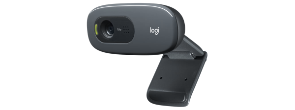
The Logitech logo identifies the brand across hardware, accessories, and software. It uses a simple lowercase wordmark and a geometric symbol that signals a modern design approach. The logo supports strong recognition across devices, packaging, and digital spaces.
1) Logitech logo explained
The Logitech logo uses a minimal wordmark spelled “logi.” The company adopted this style to improve readability and align with modern design trends. Its simple shapes make the logo work across small screens and large physical products.
Core design elements
The logo uses rounded sans-serif lettering and a clear geometric symbol. This combination keeps the design clean, friendly, and recognizable. The balanced spacing supports sharp legibility on devices and packaging.
Meaning behind the symbol
The symbol uses simple geometric forms that represent precision and creativity. This design reflects the brand’s focus on digital tools and user-centered products. It also helps distinguish the current logo from earlier, more complex designs.
2) Logitech logo history
The Logitech logo changed several times as the company expanded into new product lines. Each redesign supported a shift in technology, branding, or target audience. The logo now reflects a modern, flexible identity.
Early Logitech logos (1980s–1990s)
The original logo used an abstract eye shape. It highlighted the company’s work in computer peripherals and early digital tools. The design looked more artistic than the current streamlined version.

Modernization phase (2000s)
The brand started moving toward simpler shapes and less visual clutter. This change supported better performance on screens and printed materials. It also aligned with broader design trends across tech companies.

The 2015 rebrand to “logi”
The 2015 redesign introduced the lowercase “logi” wordmark and bright colors. Logitech used this shift to refresh its identity and appeal to modern consumers. The updated look helped the brand communicate a more playful and design-forward message.
3) Why Logitech changed its logo
Each redesign supported changes in Logitech’s business strategy and products. The current logo supports versatility and fits a broader hardware ecosystem. It works well for gaming gear, productivity devices, and creative tools.
Aligning with modern product categories
The newer logo reflects Logitech’s shift into mobile accessories, creator equipment, and gaming devices. The simplified design works better for these diverse markets. It strengthens the brand identity across both lifestyle and professional products.
Improving digital readability and scalability
Digital branding requires logos that remain clear at small sizes. The “logi” mark scales cleanly on mobile screens and app icons. The new design solved issues found in older, more detailed logos.
4) Logitech logo variations
Logitech uses several approved logo formats across its products and marketing. These variations support flexible placement and consistent brand identity. Different versions appear on packaging, software, and accessories.
Full wordmark (“logi”)
The full wordmark appears on packaging, product boxes, and digital pages. It provides the clearest brand recognition. This version works best in most general placements.

Icon-only or symbol-only mark
Logitech uses a standalone symbol where space is limited. It appears on software icons, compact surfaces, and accessories. The icon preserves recognition without requiring the full wordmark.
Color and monochrome variants
Logitech has official color, black, and white variants for different backgrounds. These variations ensure visibility across light and dark surfaces. Designers choose the version that maintains proper contrast.
5) Official colors and typography
Logitech’s brand uses clear, modern color tones and rounded typefaces. These choices support a consistent design system. They also align with the company’s focus on clean product aesthetics.
Logitech color palette
The palette includes bright accent colors and neutral tones. These colors support both playful and professional product categories. Each color maintains consistent contrast and clarity.
Typography guidelines
The logo uses a custom-styled rounded typeface. This design keeps the lettering soft and approachable. It also improves screen readability across devices.
6) How the Logitech logo is used
Logitech applies clear placement and spacing rules for its logo. These guidelines ensure visibility and consistency across products. They also prevent distortion or misuse.
Clear space and size rules
The logo requires open space around the wordmark for readability. This prevents overlap with text or other graphic elements. Minimum size rules keep the logo clear on small hardware surfaces.
Where each logo version appears
The full wordmark appears on product boxes and websites. The icon-only mark appears on compact spaces such as buttons or app icons. Each version fits its intended layout without reducing clarity.
7) Logitech sub-brand logos
Logitech manages several sub-brands for gaming and creator products. These divisions use distinct logo styles that match their audiences. Each variant maintains a connection to the core Logitech identity.
Logitech G (gaming division)
The gaming division uses a sharp, angular “G” icon. This style fits the visual themes used in gaming hardware. It signals performance and a more technical aesthetic.

Logitech for Creators
This sub-brand uses a variation that feels more artistic. It supports creators, streamers, and digital artists. The softer design blends with lifestyle-driven content.
FAQs about the Logitech logo
Why does the logo say “logi”? The company shortened the name to support a modern identity. The style improves readability and fits digital-first branding. It also highlights the company’s updated design direction.
Is the old eye-shaped logo still used? Some older hardware may still display the original design. Logitech no longer uses the eye logo in new products. The older mark remains part of the company’s visual history.
Can I use the Logitech logo in my project? Usage depends on licensing and brand-permission rules. Logitech controls how its logo appears in media and products. Unauthorized editing, distortion, or reproduction is not allowed.
Summary
- The Logitech logo uses a simple lowercase wordmark for clear recognition.
- The brand updated its design over decades to match new product categories.
- Variations include full wordmarks, icons, and color formats.
- The logo follows spacing and placement rules for clarity.
- Sub-brand logos support gaming and creator-focused products.
The current Logitech logo reflects a modern, flexible identity built for digital and hardware environments. Its clean design scales across small screens and large devices. The logo’s evolution shows how Logitech adapted its brand as technology and design trends changed.


Discussion (0)
Be the first to comment.