




AI logo generators work best when they remove guesswork instead of adding choices. Design.com’s AI logo generator follows that principle by producing complete logo concepts first, then letting you refine only what matters.
This guide walks through the process exactly as a non-designer would experience it, focusing on clarity, control, and usable results.
Step 1: Start the AI logo generator with your brand name
- Open Design.com’s AI logo generator.
- Enter your business or brand name.
- Start the logo generation process.

This first input sets the tone for everything that follows. The AI reads your business name closely, using its length, capitalization, and spacing to decide how bold the typography should feel. Picking the closest industry helps the generator lean toward layouts and icon styles that already make sense for your field. If your business fits more than one category, it often helps to open another tab and try a second option. Comparing results side by side gives you clarity much faster than trying to force one direction to work.
Step 2: Review AI-generated logo concepts
- Scroll through the first set of generated logos.
- Look for designs with clear text and balanced spacing.
- Set aside three to five options that feel usable.

At this stage, the goal is not to find the perfect logo but to spot designs that behave well. Some logos stretch naturally into a wide shape, which works better for website headers or email signatures. Others feel compact and centered, making them better candidates for social profile images or icons. Color can be distracting here, so it helps to mentally strip it away and focus on whether the structure still holds up.
Step 3: Use filters to reduce noise
- Apply logo style filters such as wordmark, emblem, abstract, mascot, or corporate.
- Apply a color direction filter to narrow visual tone.
- Review the refined results and pick one logo to continue.
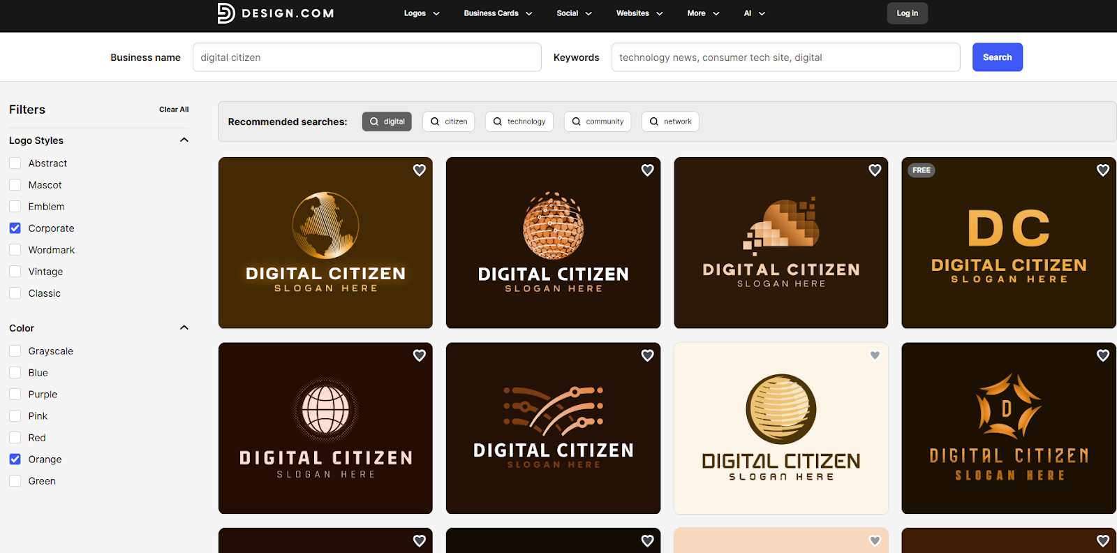
Filters do more than tidy up the page. They shift the AI’s visual direction in noticeable ways, changing how typography and icons relate to each other. This step works best when you already have an idea of where your logo will live most often. Brands that rely heavily on social media tend to benefit from stronger contrast, while logos used across documents and websites often feel more confident when colors stay restrained.
Step 4: Confirm the core logo structure
1. Select your preferred logo and click on it to make make further adjustments.
2. Choose a temporary color palette.
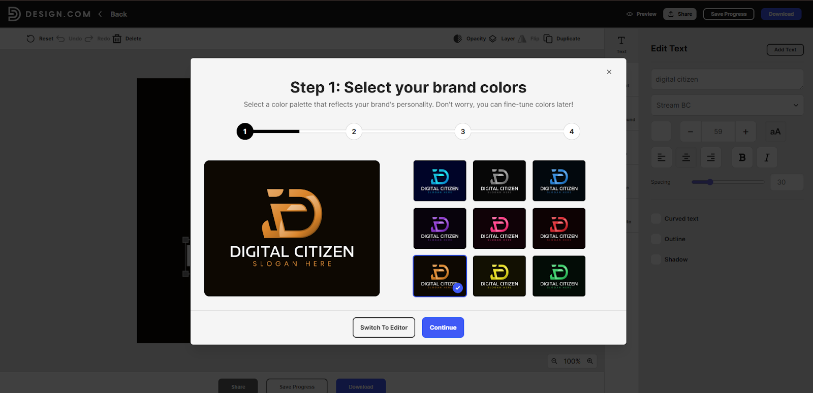
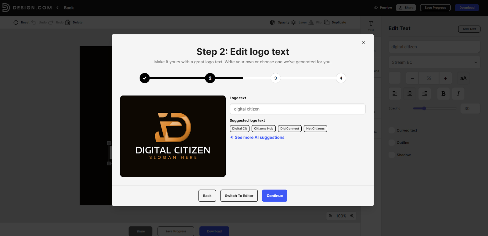
3. Review the brand name text.
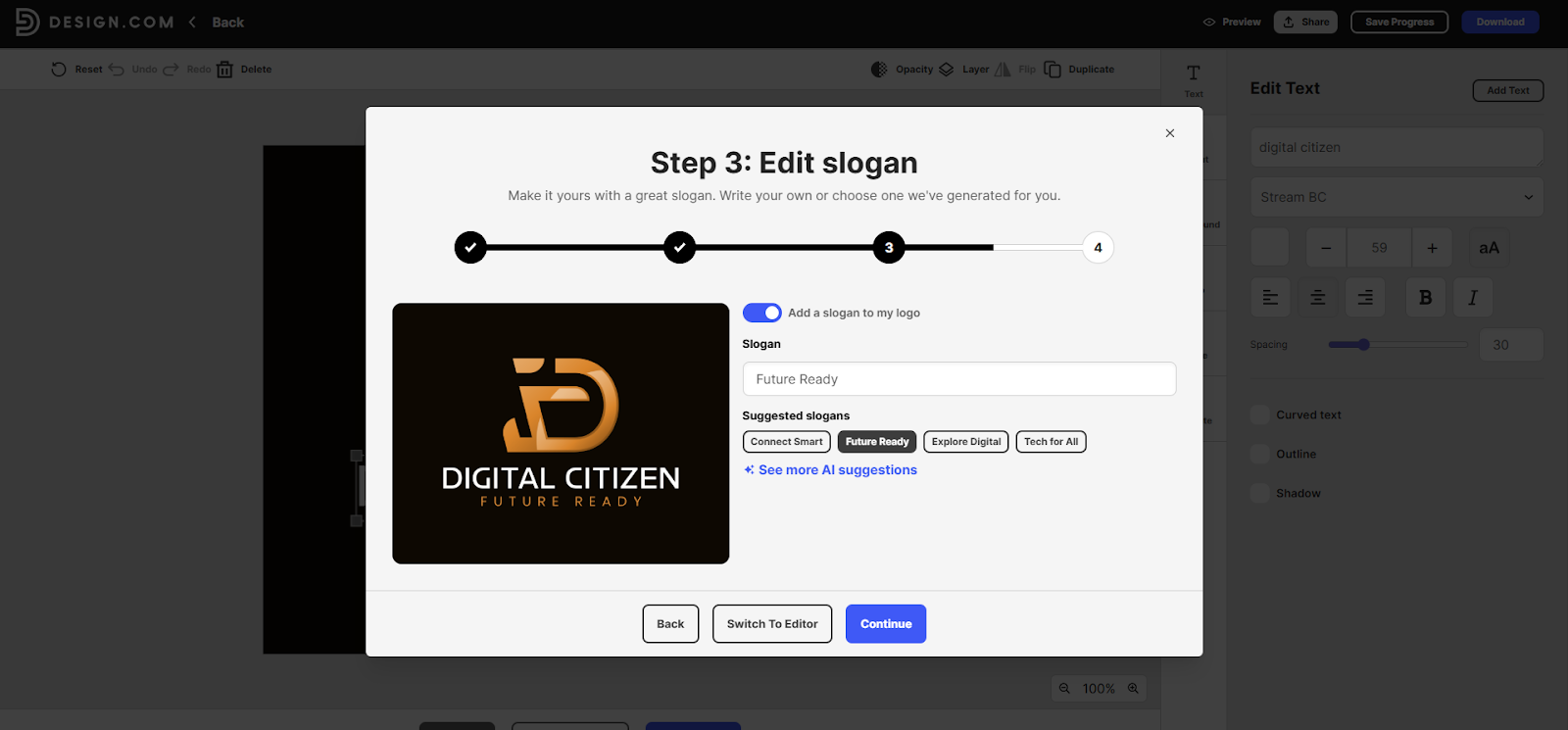
4. Add a slogan or disable the slogan option if you don’t want it.
- Proceed to the editor if refinement is needed.
This is the moment where many beginners pause longer than necessary. The purpose here is not perfection but commitment. A solid structure makes later refinements easier and keeps the logo stable as you make changes. Text balance matters more than icon detail at this stage, because typography carries the brand name everywhere the logo appears.
Step 5: Customize fonts, colors, icons, and layout
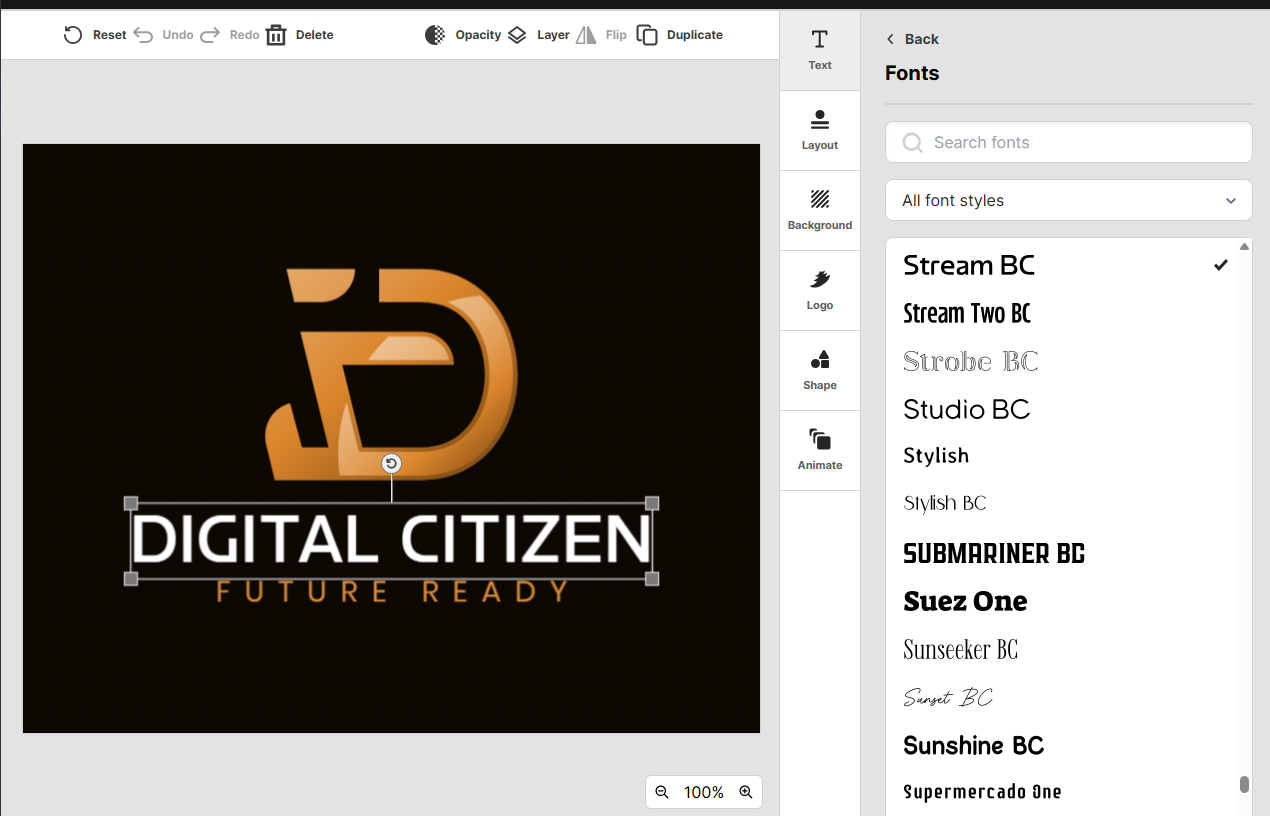
1. Change fonts using the built-in library of over 750 fonts, including 525 exclusive options.
2. Test different layout orientations.

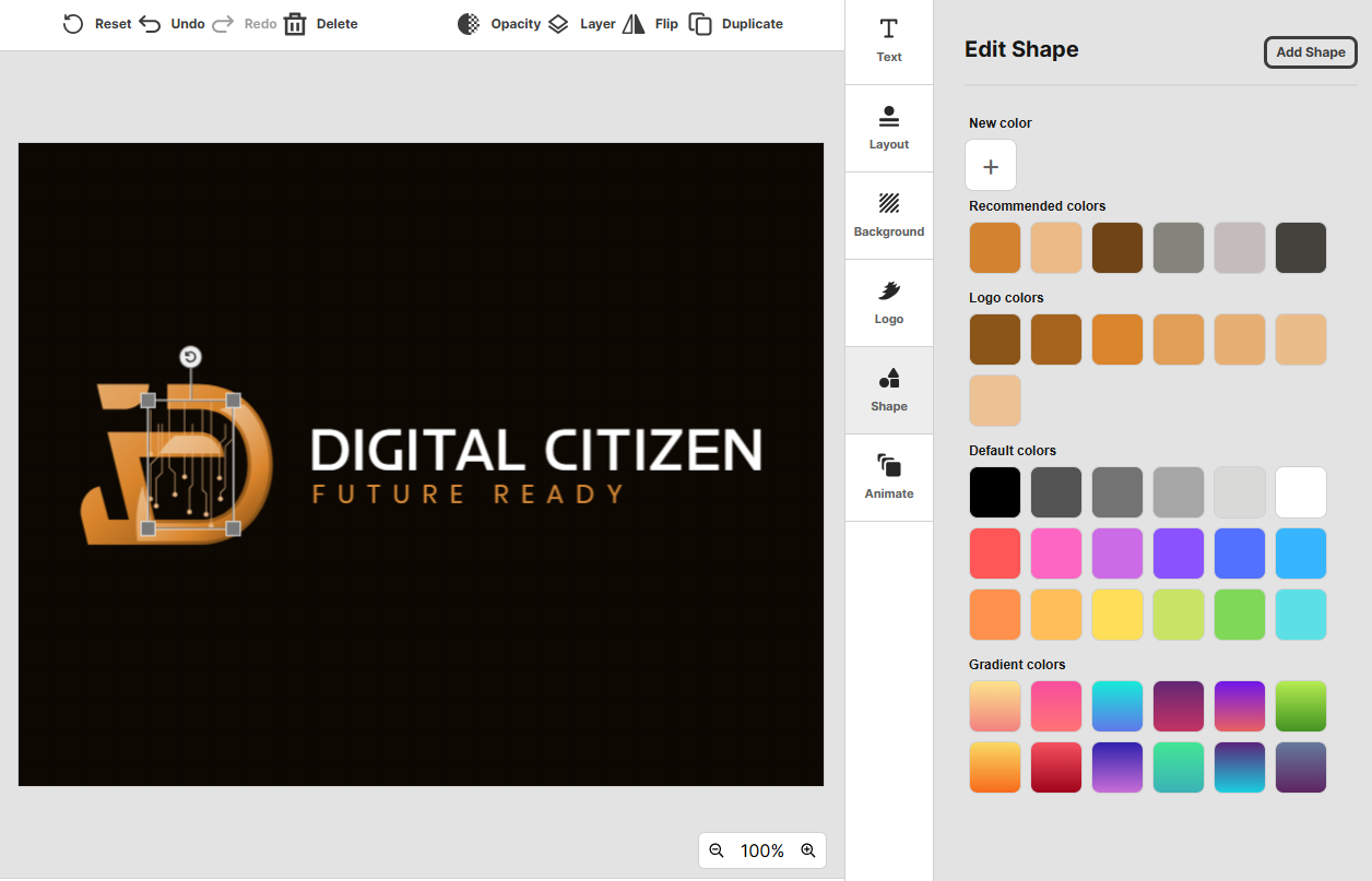
3. Replace icons if needed.
4. Preview simple animations if your brand benefits from motion.

Font choice shapes how trustworthy or expressive your brand feels. Clean, straightforward fonts often signal reliability, while more decorative styles work best when personality is the main focus.
Color choices matter just as much. Limiting yourself to one or two main colors usually results in a logo that feels intentional instead of busy. Saving both a wide and stacked version now prevents awkward resizing later.
Step 6: Fine-tune spacing in the advanced editor
1. Open the advanced editor.
2. Adjust spacing and proportions gradually.

3. Re-check balance after each change.
4. Save the updated logo.
Small spacing changes often have the biggest impact. Slightly increasing space between letters or resizing an icon can make the entire logo feel calmer and more readable. If you find yourself making large adjustments repeatedly, it usually means the starting template was not the right match. Switching to another option often produces better results than forcing refinements.
Step 7: Check real-world readability
- Preview the logo at reduced sizes.
- Toggle the slogan on and off.
- Confirm the logo stays legible and balanced.
A logo that only looks good at full size tends to struggle in practice. Shrinking the preview reveals whether the typography and icon still communicate clearly. Imagining the logo in black and white also helps confirm that the structure, not decoration, carries the design.
Step 8: Download logo files for real use
- Open the export options.
- Download vector formats such as SVG, EPS, or PDF.
- Download PNG or JPG for digital use.
- Save transparent and icon-only versions.
- Download animated formats if applicable.
Even brands that start online benefit from having vector files ready. They make future printing, scaling, and layout changes easier without revisiting the design process.
Step 9: Save and organize logo versions
- Save your final logo.
- Keep horizontal, stacked, and icon-only variations.
- Revisit the logo if your brand evolves.
Keeping multiple versions helps your logo adapt as your business grows. Saving earlier versions also makes it easier to reference or reuse elements later, especially during updates or rebrands.
Summary
Generating AI logos with Design.com works best when you focus on structure first and refinement second. Starting from complete logo concepts removes uncertainty and helps non-designers make confident decisions early.
By narrowing options thoughtfully, refining typography and layout with intention, and exporting the right formats, you can create a logo that works across websites, social platforms, and print without needing design experience.


Discussion (0)
Be the first to comment.