




A business logo needs to stay clear in common places like a website header, a social profile image, and printed materials. Design.com’s logo maker helps beginners by starting with complete logo layouts and letting you refine them safely.
Here’s how to do it, plus a few tips and tricks for getting the best results possible.
Step 1: Enter your business name

- Open Design.com’s logo maker.
- Enter your business name.
- Hit the Create Logos button.
Use the exact spelling of the brand you want the end product to have. The logo maker will still generate different logo styles, and you can adjust them later, but it will primarily base the results on what you input.
You can also open 2-3 tabs and play around if you’re not sure. Just to experiment.
Before moving on, pause for a moment and confirm how you want people to read your business name. Many beginners later realize they want a different capitalization or spacing after exporting the logo. Locking this early prevents unnecessary revisions later.
Step 2: Scan results

- Review the first page of logo results.
- Identify 3–5 logos with clear text and balanced layouts.
Some tips to keep in mind:
- Favor horizontal layouts if you plan to use website headers and email signatures.
- Favor compact layouts if you plan to use a logo as a profile image.
- Avoid designs where the icon turns into an unrecognizable shape at small size.
At this stage, think about function, not preference. A logo that looks interesting but struggles at smaller sizes often creates problems later. Prioritizing clarity now saves time and rework once the logo is in use.
If you’re not sure what to pick, you can filter it out more, as shown below:
Step 3: Narrow choices with style and color filters
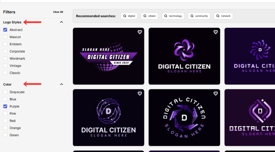
- Use the logo style filters (for example: wordmark, emblem, abstract, mascot, corporate, vintage, classic).
- Apply a color scheme filter that fits your brand direction.
- Re-scan the filtered results and pick one logo to refine.
Tips:
- Use style filters to remove entire directions instead of fixing them later.
- Pick a high-contrast palette if you expect heavy social media use.
- Pick neutral tones if you want a professional, clean look across documents.
Filters work best when you already know where your logo will appear most often. If your brand lives mainly online, contrast matters more than subtlety. If it appears on invoices, websites, and printed materials, restraint usually reads as more professional.
Step 4: Open the editor and lock the core look
1. Click the logo you want to refine.
2. Select a preferred color palette (You can change it later).
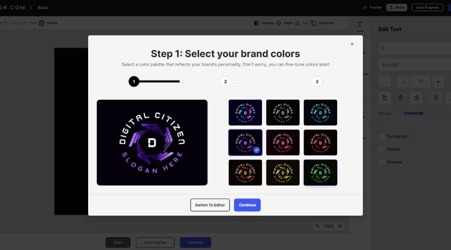
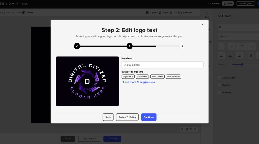
3. Refine your logo text. Adjust spelling and grammar if necessary. At this stage you also have some AI brand name suggestions if you need a bit of a brainstorming session.
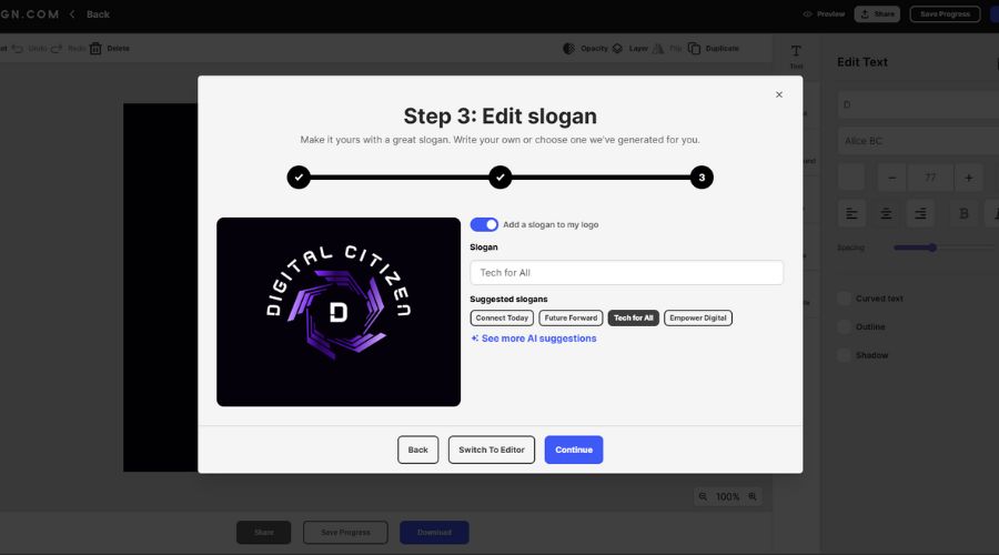
4. Type your slogan or use the AI slogan generator. Untoggle the slogan option if you don’t plan on using one.
5. If you’re happy with your result now, hit Download Now. But if your logo needs further adjustments, click Switch to Editor.
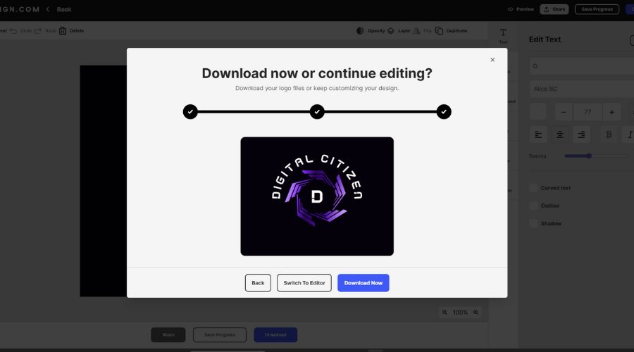
Tips and tricks:
- Choose the logo with the best text balance, even if the icon feels average.
- Treat the first selection as a base, not the final result.
This is the moment where beginners often overthink. The goal is not to find a perfect logo instantly, but to lock a structure that behaves well. A strong structure makes later edits faster and safer.
Step 5: Adjust fonts, colors, and text
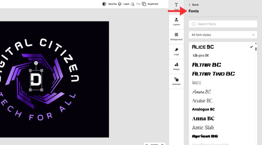
1. Change the font using the built-in font library (750+ fonts, including 525+ exclusive fonts).
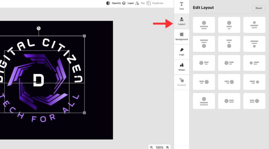
2. Play around with layouts. Keep in mind the primary ways in which you’re going to use your logo.
3. You can also edit the background color. Again, keep in mind how you’ll use it, whether you have to integrate it within a website theme or an already complex color scheme. Best to go for neutrals. With each design, you’ll also get a version of your logo with a transparent design.
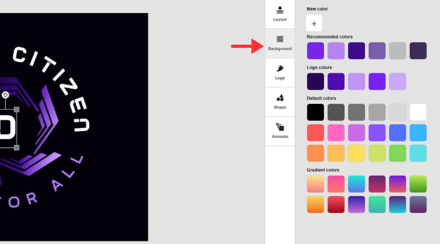
4. Next, go ahead and adjust the logo’s icon color. Here you can play around with various shades of the same color, try out different colors, and really do some fine-tuning.

5. Now, if you’re not truly sure about the graphic elements, you can change up the logo’s shapes. Here, you get to choose from a wide variety of icons and graphics that fit all industries, from simple lines to fashion, flags, and more.

6. Finally, you can also add quick and effective animations to your logo. Check them out and fit the option that best suits your brand.
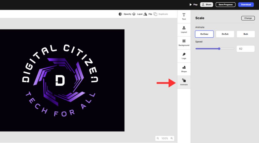
Keep in mind that font choice affects perceived trust more than most beginners expect. Clean, legible fonts tend to feel more established, while decorative fonts work best when the brand already relies on personality or entertainment value.
When it comes to layout, having a wide and compact version from the start prevents awkward resizing or cropping later
Step 6: Refine spacing in the advanced editor
1. Open the advanced editor.
2. Adjust spacing or proportions in small increments by dragging and dropping.

3. Re-check readability and balance after each change.
4. Save your updated design.
Getting started tips:
- Increase spacing if text feels cramped or crowded.
- Resize the icon slightly if it overpowers the name.
- Return to a different template if you feel tempted to rebuild everything.
If spacing adjustments start to feel complicated, it usually means the original template was not the right fit. Switching templates often produces better results than heavy editing.
Step 7: Do a real-world readability check
- Preview the logo at smaller sizes.
- Check how it looks with and without a slogan.
- Confirm it still feels balanced and readable.
Keep in mind:
- If the logo only looks good large, simplify the icon or typography.
- Make sure it would still work in a simple black-and-white use case.
A strong logo should remain recognizable even without color. This check helps confirm that the structure, not decoration, carries the design.
Step 8: Download the best formats for business use
- Open the download/export options.
- Download vector files for scaling and print use (SVG, EPS, PDF).
- Download raster files for web and social use (PNG, JPG).
- Download transparent background and icon-only versions if available.
- Download animated formats (GIF, MP4) if you need motion assets.
Even if you only plan digital use today, vector files protect you from quality loss if your logo later appears on signage or printed materials.
Step 9: Save your logo set for future reuse
- Save your final logo in your account.
- Keep a small set of versions: horizontal, stacked, and icon-only.
- Revisit later if your brand colors or tagline change.
Summary
Start by entering your business name. The logo maker uses AI to infer the most relevant industry and related keywords from the name, generating logo options that already match your field without requiring manual selection. This step shapes the initial designs and removes the need to describe visual preferences in design terms.
Use style and color filters to quickly narrow results and eliminate directions that do not fit your brand. Focusing on layout and readability early helps you reach a usable logo faster.
Refine the selected logo by adjusting fonts, colors, text, and layout while keeping the structure intact. Finish by exporting vector and PNG formats so the logo works across digital and print use cases.


Discussion (0)
Be the first to comment.