


Most people place their router wherever the ISP technician put it during installation. That is usually where the cable enters the building, which is almost never the best place for coverage. Dead zones appear, video calls drop in specific rooms, and the fix is always the same: move the router closer to wherever the problem is, hope for the best, and repeat the guesswork indefinitely.
There is a better way. Signal mapping turns the guesswork into a visual picture of exactly where your Wi-Fi is strong, where it is weak, and what is causing the drop. It takes about thirty minutes, requires only a smartphone or laptop, and the results tell you more about your network than years of anecdotal experience ever would.
Why Router Placement Matters More Than Most People Realise
A router does not fire its signal in a straight line like a torch. It radiates outward in all directions simultaneously, closer to a bubble than a beam. Every wall, ceiling, floor, metal object, and appliance the signal passes through absorbs some of it. By the time the signal reaches the far corner of a house, it has passed through multiple obstacles and arrived considerably weaker than it left.
Where the router sits determines which obstacles the signal has to fight through to reach every part of your home. A router in a corner of the ground floor has to push its signal through the entire length of the house horizontally and up through the ceiling vertically before it reaches an upstairs bedroom at the opposite end. Move that router to the centre of the ground floor and the signal to that bedroom travels a much shorter distance through fewer obstacles.
The effect is not subtle. Moving a router from a corner cabinet to a central shelf can double or triple signal strength in distant rooms. The speed difference at the device level can be dramatic.
Understanding Signal Strength Numbers
Before mapping, it helps to know what you are measuring. Signal strength is expressed in dBm, which is a negative number. The less negative the number, the stronger the signal.
Minus 30 dBm is excellent and rarely achieved outside of the same room as the router. Minus 50 to minus 60 dBm is good and handles everything comfortably. 70 dBm is usable but noticeably slower and prone to dropouts during congestion. Below minus 80 dBm is weak enough to cause regular problems. Below minus 90 dBm is effectively unusable for anything demanding.
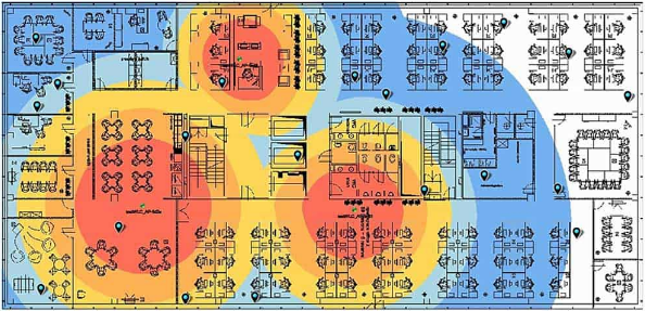
Most signal mapping tools colour-code their output using these thresholds. Green means strong, yellow means acceptable, orange means marginal, and red means poor. The colour map makes it immediately obvious which rooms have coverage problems without needing to interpret raw numbers.
The Tools You Need
You do not need expensive equipment. A smartphone and one of the following free or low-cost apps is everything required.
NetSpot is the most capable option for a full signal map. It runs on Windows, macOS, and Android. The desktop version is the most powerful: you import a floor plan image of your home, walk around placing measurement points on the map as you go, and the app builds a colour-coded heatmap from your measurements. The free version covers everything a home user needs. NetSpot is the tool to use if you want the most accurate and visually clear picture of your coverage.
WiFiman by Ubiquiti is a free iOS and Android app that creates a real-time signal map as you walk around with your phone. It does not require a floor plan upload, which makes it faster to get started. The resulting map is less precise than NetSpot's floor plan-based approach, but for quickly identifying weak spots and testing improvements it works very well. It also shows every Wi-Fi network in range, their signal strengths, and the channels they are using.
Wi-Fi Analyzer is a free Android app focused on channel analysis and real-time signal graphs rather than full heatmapping. It is useful for quickly checking signal strength in specific rooms and identifying channel congestion, but does not produce the visual coverage maps that NetSpot and WiFiman do.
For most home users, WiFiman on a phone for a quick walk-around survey and NetSpot on a laptop for a detailed analysis covers everything from initial troubleshooting to informed placement decisions.
How to Create a Signal Map With NetSpot
Step 1: Prepare Your Floor Plan
Draw a simple sketch of your home's layout, or find one if you have it from when you bought or rented the property. It does not need to be architecturally precise. A rough outline showing rooms, hallways, and the location of stairs is sufficient. Take a photo of the sketch if you drew it by hand, or use any image file you have.
Open NetSpot and start a new survey. Select the Active Survey mode, which measures both signal strength and actual network speed at each point. Upload your floor plan image and scale it by indicating the real distance between two known points on the map, such as two walls of a room you can measure.
Step 2: Walk the Measurement Grid
Click the point on the map that corresponds to where you are standing, wait for NetSpot to complete its measurement, then move to the next position. Work systematically through the home in a grid pattern, taking measurements every two to three metres. More measurement points produce a more accurate heatmap.
Cover every room, hallway, and outdoor area you care about. Include the spots where you most often experience problems. Take measurements at different heights if you use devices both on desks and on the floor, since signal distribution varies vertically.
The survey takes fifteen to twenty minutes for a typical house. NetSpot builds the heatmap in real time as you add measurement points.
Step 3: Read the Results
When the survey is complete, NetSpot presents a colour-coded map overlaid on your floor plan. Switch between different visualisation layers depending on what you want to understand.
The Signal Level layer shows overall coverage strength. This is the starting point for identifying dead zones and confirming which areas have good coverage.
The Signal-to-Noise Ratio layer shows how much of the signal is usable compared to background radio noise. A high signal level in a room with significant interference from neighbouring networks or nearby electronics can still produce poor performance. The SNR layer reveals this even when the raw signal level looks acceptable.
The Download Speed layer, available in the Active Survey mode, shows actual achievable throughput rather than just signal presence. A room might show adequate signal strength but poor actual speed due to interference, channel congestion, or distance effects. The speed layer catches this.
What the Map Typically Reveals
A signal map of a typical home usually shows a few predictable patterns that most people find surprising when they see them visually for the first time.
The router's immediate surroundings are fine. The area within five to ten metres of the router in an open plan space shows strong signal regardless of where the router is positioned within reason. The placement debate is always about what happens at the edges.
Solid walls create dramatic drops. A signal that reads minus 55 dBm on one side of a thick brick or concrete wall can drop to minus 75 dBm on the other side of the same wall. The map makes this visible as a sharp colour boundary rather than a gradual fade.
Metal objects create dead zones behind them. Metal filing cabinets, large kitchen appliances, and steel-framed structures block signal almost completely. Anything placed directly behind a metal object from the router's perspective will see poor coverage regardless of distance.
Floors attenuate signal significantly. Signal travelling vertically through a floor typically loses more strength than signal travelling the same distance horizontally through open space. Upstairs rooms almost always show weaker coverage than ground floor rooms at equivalent distances from the router.
The router's current position is usually not the best one. This is the most consistently useful finding. Almost every home survey reveals a more central or less obstructed position that would improve coverage at the weakest points without significantly affecting the strongest areas.
How to Use the Map to Optimise Placement
With the baseline map complete, the process becomes scientific rather than guesswork.
Identify the rooms or areas that showed the weakest signal. Note what lies between those areas and the router's current position. Walls, floors, metal objects, and the straight-line distance are the factors to consider.
Mark a candidate position for the router on the floor plan that is more central relative to the areas that need better coverage, or that has a less obstructed path to the weak spots. Move the router to that position physically, run a second survey covering the same measurement points, and compare the two heatmaps side by side.
NetSpot preserves previous surveys and allows direct comparison between them. The visual difference between a before and after map is usually immediately convincing. You can see the green areas expand and the red areas shrink as the router position improves.
If no single router position covers the entire home adequately, the map also tells you where to place an additional access point or mesh node. The ideal location for a second access point is where the first one's coverage drops below acceptable levels, which the colour boundary on the map shows precisely.
The Physics of Placement: What Always Helps
Beyond the mapping exercise itself, a few placement principles hold universally and explain why the maps look the way they do.
Central placement beats corner placement. A router radiates equally in all directions. Placed centrally, equal amounts of that radiation reach equal distances in every direction. Placed in a corner, the majority of the radiation goes into walls and outside the building rather than into the rooms you need it to cover.
Height improves coverage. Signal broadcasts downward at an angle as well as horizontally. A router on a shelf two metres from the floor reaches more of the room below it than one sitting on the ground. In a two-storey home, placing the router near the ceiling of the ground floor or the floor of the upper storey balances coverage between levels better than either extreme.
Open placement beats enclosed placement. A router inside a cabinet or behind a television is fighting its own housing before the signal even reaches the room. Every enclosed surface absorbs or reflects the signal. A router in open air on a shelf performs noticeably better than the same router tucked into a media unit.
Distance from competing devices reduces interference. Microwave ovens, baby monitors, and older cordless phones all operate on frequencies near the 2.4GHz Wi-Fi band. A router placed on top of or directly next to these devices experiences interference that reduces effective range. Separating them by a metre or more measurably improves signal quality in the 2.4GHz band.
When a Better Position Is Not Enough
Some homes have layouts that no single router position can cover adequately. A long narrow house with thick walls between rooms, a multi-storey property with concrete floor slabs, or a home with a metal-framed extension are examples where the physics simply cannot be overcome by placement alone.
The signal map makes this clear quickly. If testing three or four candidate positions consistently leaves significant areas in orange or red regardless of where the router goes, you have confirmed that a second access point, a mesh system, or a powerline adapter is necessary rather than just a potential improvement.
This is a more useful outcome than it might seem. Rather than spending money on a signal booster and placing it somewhere that might or might not help, you have data showing exactly where coverage drops and can place any additional hardware at precisely the point where it is needed.
Frequently Asked Questions
How long does a home Wi-Fi signal survey take?
For a typical house using NetSpot on a laptop, a survey covering a reasonable grid of measurement points takes fifteen to thirty minutes. Smaller homes or apartments can be done in ten minutes. The time depends primarily on how many rooms you cover and how densely you space your measurement points. A denser grid produces a more accurate heatmap but takes longer. For a first survey, spacing points three to four metres apart covers the home well without taking an excessive amount of time.
Do I need a paid app to map my Wi-Fi signal?
No. NetSpot's free version covers everything a home user needs for signal mapping. WiFiman is completely free on both iOS and Android. Wi-Fi Analyzer for Android is free. The paid versions of these tools add features relevant to IT professionals and network engineers, such as automated reporting, multi-site management, and professional export formats. For optimising your home network, the free versions are entirely adequate.
Does the 5GHz band need a separate survey from the 2.4GHz band?
Yes, and the results are often noticeably different. The 5GHz band offers faster speeds but shorter range and less ability to penetrate walls. The 2.4GHz band reaches further and passes through obstacles better but offers lower peak speeds and is more crowded with interference from neighbouring networks. NetSpot and similar tools can filter measurements by band, letting you create separate heatmaps for each. In practice, the 5GHz coverage usually drops off significantly faster with distance and through walls, which the map makes visually clear.


Discussion (0)
Be the first to comment.