



One of the biggest changes in Windows 8 is the fact that the Start Menu has been replaced by the Start Screen and now you have a very different way of launching applications. While the Start Screen is great for making instant searches and launching applications with a few keystrokes, it is not that friendly to users who love using the mouse instead of the keyboard. Therefore, I decided to make a quick analysis and see how the new Start Screen compares to the old Start Menu. Does it help in getting faster access to all the shortcuts installed by your applications? Let's find out!
NOTE: The analysis was updated for Windows 8 Release Preview. Unfortunately there are not many positive changes to report and the conclusions and recommendations of this article are the same as for the Windows 8 Consumer Preview.
The Applications Used for the Analysis
For my experiments, I chose a set of popular applications used by many Windows users: Mozilla Firefox, uTorrent, 7-Zip, Auslogics Disk Defrag, Notepad++, ImgBurn, Winamp, Dropbox, Mozilla Thunderbird, K-Lite Codec Pack, Skype, Adobe Reader X, Paint.NET, LibreOffice 3.5, Yahoo Messenger.
They were installed using their default options. Exceptions were made for software that wanted to install toolbars and other unwanted third-party software (e.g. Winamp and Yahoo Messenger). For those applications I did not allow the installation of any unwanted software.
The Windows 8 Start Screen
Windows 8 has replaced the Start Menu with the Start Screen. Its location in the Windows file system is the same though.
Both in Windows 7 and Windows 8, the folders and shortcuts that make up the Start Menu and the Start Screen are found in two folders: "C:UsersUser NameAppDataRoamingMicrosoftWindowsStart Menu" and "C:ProgramDataMicrosoftWindowsStart Menu".
This is how the Start Screen looks like after installing the applications I used for the analysis. I find it pretty crowded and disorganized.
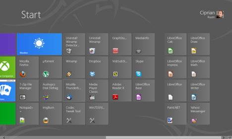
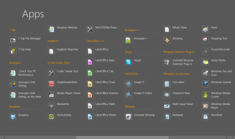
When I right click and choose All apps, I get something very similar to the Start Menu in Windows 7. A much more organized structure of shortcuts, which looks a lot like the classic Start Menu experience.
The Windows 8 Desktop
Luckily, with the exception of the missing Start Menu button, the Desktop has remained unchanged in Windows 8, compared to Windows 7.
Also, their location in the file system is the same: "C:UsersUser NameDesktop" and "C:UsersPublicDesktop".
This is a screenshot of the Desktop, after installing all the applications I used for this analysis.
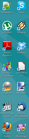
It looked the same in both operating systems and I was happy to see there were no differences.
Start Screen vs. Start Menu: How Many Shortcuts Are There?
I installed the same set of applications, with the same installation options on both Windows 7 and Windows 8 Release Preview. Then, I counted the number of shortcuts found in both operating systems. In the table below you can find the number of shortcuts installed by each application on the Desktop, the Windows 8 Start Screen and All apps list and in the Windows 7 Start Menu.
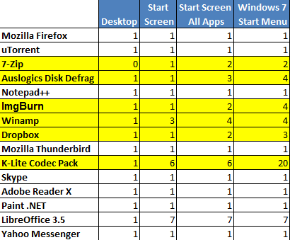
After counting all the shortcuts, I noticed that there are important differences between the number of shortcuts displayed on the Windows 8 Start Screen, the All apps list and the Windows 7 Start Menu:
- The Start Screen tends to display a smaller selection of shortcuts than what is installed by each application. The selection criteria seem to be random. For example, Winamp had its Uninstall shortcuts displayed while the other programs did not. Even programs which stored shortcuts in the same Start Menu folder as Winamp, did not have their Uninstall shortcuts displayed. Last but not least, K-lite Codec Pack installs a total of 20 shortcuts in its Start Menu folder in Windows 7 but only 6 in Windows 8. I am not sure if this behavior is a bug in the installation process or if in Windows 8 less features and tools are needed. Windows 8 Release Preview displays all 6 shortcuts installed by the tool.
- The shortcuts on the Start Screen are not organized in any way. They are simply added to the list of existing tiles shown on the Start Screen. You quickly end up having a pretty chaotic list of shortcuts. For example, if you look at the screenshot below, the shortcut for uninstalling Winamp is shown above the shortcut for running Winamp. Then, the LibreOffice Base application is in a separate group than the other LibreOffice shortcuts. Also, Paint.NET and Yahoo Messenger ended up in the same group with most LibreOffice shortcuts. It's pretty confusing to find your way between all these shortcuts. There is no obvious logic to the way they are grouped and listed. I even looked to see if the shortcuts are added in the order programs were installed. Unfortunately that doesn't happen either.
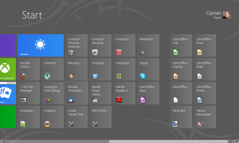

Windows 8 Start Screen - The All-apps list is organized a lot better. Finding your way with the mouse is easier and less frustrating. The folder structure created by the applications in the Start Menu folders is respected and this leads to a better organisation and flow of the entire list.
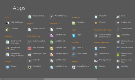

Windows 8 Start Screen - The All-apps list still misses a number of shortcuts and doesn't allow access to useful things such as uninstall shortcuts for some applications (e.g. ImgBurn). Again, the criteria for selecting which Uninstall shortcuts get displayed and which do not, seems random. It doesn't seem to have any connection to the folder location where they are stored.
What Microsoft Needs to Change About the Start Screen!
Looking at this experiment and the whole testing experience I had so far with the Windows 8 Start Screen, I find it poorly organized, inconsistent and sometimes confusing. I strongly believe Microsoft needs to make some serious changes and improvements, in order to provide a good experience. My top suggestions are the following:
- Microsoft should clarify the criteria based on which Windows 8 selects the shortcuts displayed on the Start Screen. I understand that showing all the shortcuts installed by applications doesn't help users and their number should be limited. However, the criteria used for the selection should be clear, consistent and well communicated to software developers.
- The Start Screen needs a better algorithm for grouping shortcuts. The way it is now, I find it lacking in efficiency and friendliness. Especially for users who are not very technical. Using the folders created by applications in the Start Menu folders and grouping them in a similar way to the All apps list might be better for users. Or, at least, group all shortcuts installed by an application in the same block of shortcuts.
- The All apps list should stop hiding shortcuts. It should display absolutely all shortcuts installed by applications in their Start Menu folders.
If these changes are made, I believe that people will need less time to accommodate with the new Start Screen. Combining its strong search features with a better organisation for those who prefer using the mouse, will make people feel at ease and never miss the old Start Menu.
Conclusion
I am curious to know what is your experience with the new Start Screen: Did you enjoy using it? Do you believe it needs some further tweaking? Do you agree with the points I raised in this article?
I am looking forward to having a constructive discussion on this topic.
Discussion (30)
MICROSOFT WINDOWS 8
im using win8 for almost half a year now. after that i tried using a third party start menu and all i could say is that i’m not missing it at all. i uninstalled the 3rd party app *immediately* and returned to startscreen. if there’s an app not pinned to the screen, i just type it (ex: run or update). it makes me know more about the name of the apps hehehe. i always forget the names cmd, run, disk management, device manager, until i use win8. before i always google whenever i need them. but now, i can easily remember hahahaha startscreen kept my memory working and i liked it 🙂
there’s things that i don’t like abt win8. but i’m with MS for replacing the startmenu with startscreen. 🙂 i liked how i can personally arrange the pinned apps and make them larger/smaller, and with the 8.1 update, i like it even better now i can make them even smaller or larger.
I cant understand why my windows live email has a tile but my windows messenger doesn’t. Is anybody able to advance my intelligence?
Are you sure Windows Live Mail has tiles?
Anyway… tiles are added only by apps with support for this feature of Windows 8. Your usual desktop application doesn’t install tiles but shortcuts on the Start screen.
Not trying to sound like a walking advertisement or anything, but Start8 works really well if you don’t like the start screen (or prefer that it doesn’t fill your whole screen).
I am agree with you. I need “Collapse items” feature to decrease items in Start menu. I may forget app name. I meant this should show “folders” only and expand when User clicks. Likely it was in old “Start” menu.
Hmm I liked the developer preview, where you could turn off metro 😉 so I think I will like windows 8 when it arrives and you will be able to turn metro off.
Metro .. I have installed windows 8 on a windows tablet and its very very sluggish and unresponsive, it is missing some key features. e.g. the keyboard will not open when using the metro rdp app, and in fact there is no option to open the keyboard so this app is completely useless. There are probably a few more like that that I have not found yet.
Also the metro interface is very wasteful, there is buckets of screen real estate going unused and unable to use. On Android tablets there is also some parts of the screen you cannot use, but this is minimal compared to windows 8 metro. Its also very restrictive in how the apps look, all in these childlike colour blocks. Its like one of those toy computers you get your 3 year old, not a productivity suite.
It seems to be the way of things lately, just make a shiny device that can facebook and thats all you need.
in my opinion metro is a gargantuan failure. But Windows 8 booting in no time and being like Windows 7 is a winner.
I have a 4 year old desktop that boots in under 15 seconds, which is amazing I am looking forward to seeing it boot on a solid state drive. With these sorts of boot times it might kill off the tablet completely ( yay )
I’ve not actually used windows 8 yet, so my comments are totally off impression of what i’ve read on here and other sites. However, even with that in mind, I dont understand why they’ve changed what was an efficient way of launching new programs while still using currently running programs. As a avid user of photoshop, and premier pro. Multi tasking is very important to what I do on a day to day basis on my computer. Having to open an entirely new screen, every time I want to launch a browser window to grab source image or just check my email or whatever, while I’m doing a bunch of other things at the same time will just be distracting, and I’ll probably lose my thread where I was up to on another open program. This start screen thing, regardless of how well or how badly laid out it is, should only be an option, for those who want to use a touch screen interface, but having to let go of the mouse and use the keyboard just to launch another program makes the whole experience inefficient, and from the sound of it it takes longer just to use it
Microsoft is making the same asinine mistake that Ubuntu did with Unity and Gnome did with its new Shell. Enamored by the growth in use of tablets and smart phones, they are trying to force users into using touch-screens and a mouse-less desktop. If you want a tablet, buy a tablet, but for desktops or laptops, it is absolutely idiotic.
This whole discussion thread predominately verifies a statement I made when I first read a preview of Windows 8 even before the Developer Preview went public. “One OS cannot be optimized for all applications from cell phones to corporate desktops. If it were possible, Microsoft would NOT be the developer who produced it.”
I think MS will bring back classic start menu in windows 9 just like they changed the default action of start menu power button from sleep (in vista) to shutdown (in windows 7). MS please don’t force us to use windows phone UI. We are not using phone but PC. I feel Linux LXDE and KDE better than this
The Biggest problem is the missing Menu Start Buttom on Windows 8. What I’ve read reference Windows 8 not having a start button is that it is made for all persons who have touch screens. (all 32 people). What were they thinking. Probably more then 75% of computer owners, desk top & lap top, are not touch screens. Apparently Windows has way to many customers, buyers, and are looking to cut back on their work force. No really I am sure this is just an oversite by some newby hire and wil be fixed by the time the full version comes out. Another problem is a lot of software is not compatible with windows 8 including AOL and printer – scanner software. I hope this gets fixed or many people will be looking for a different OS. Smittt
Its all to much why is it so hard to find the folder you want and how many short cuts to it do you need it must be easy to find a folder than Windows makes it and so much wasted space on the screen do we really need to see an icon in a box ?
The more you have on the screen the more memory you use, Speed is what we need and that = memory
The start screen is useless. I run a high res multi monitor setup and resize programs in their window to get as much displayed on those monitors as possible. Basically I can view multiple programs on one monitor AND use the start button well still viewing those programs in windows 7. In windows 8 the entire screen is needed to do what just a corner of it once did. Its a waste or screen realestate. Windows for me was always good because of its ability to run and view multiple programs at the same time. Windows 8 is a step backwards as far as I am concerned. And the Aero interface in windows 7 is much more pleasing then the Commodore 64 style graphics of the windows 8 interface. Metro Ui is garbage for use on desktops. And even though people may not realize it yet it will be garbage on tablets to as many people are replacing full size PCs with tablets and expecting them to do the same tasks as they could with a full PC.
I could not agree more with you!
I don’t understand why now, we are forced to waste our entire 24inch screen to run an app, loosing sight of other running applications. Really too bad..
On top of all, the Vista and 7 Start Menu was a great extension of the task bar as far as pinned applications and recent document launching were concerned, all in just the corner of the screen.
If microsoft is smart it will leave an option to bring the old start menu back, and everyone that will have a desktop and is not a fanboy, will revert to that (if they do it you will see the statistics). If they want to force this stupid start screen on people it will cost them billions. The start screen is badly designed and implementing, confusing and aggravating even with experienced users…. I find it funny, that many people after seeing this new horrible interfaced, asked me if its a good idea to switch to mac.
why mac though? obviously you/them still have a computer so why not keep windows 7 till at least windows 9…
and if still not satisfied then linux is just a download away, if they don’t change back though, I will setup a shinny new Ubuntu desktop in the next 2 – 5 years.
plus with linux, if I do need windows VMware has always worked on it (that I know of..)
What matters is MS moves the steering wheel with each new version. Nonsense.
On top of it all we will be going thru hundreds of updates because they couldn’t get it right in the first place and blame it all on security. Ever notice car manufacturers don’t pull this crap off.
“Ever notice car manufacturers don’t pull this crap off.”
Sure they do. Ever noticed that there is more and more auto recalls to fix what appears to be basic design issues? The auto industry has had more than 100 years to get their act together and still can’t do it.
On a touch screen-based device, no doubt the Immersive UI (officially called Metro but, IMO, that just blurs the name of Microsoft’s design language, which is indeed called Metro) is a better solution. However, on a regular PC, the Start menu is better. They just need to work a little more around its edges and add some improvements to make the Start menu the perfect launcher of files and programs on Windows.
Windows 8 has a lot of improvements but as long as they don’t allow the flexibility of having the Start menu there and allowing the user to disable the Immersive UI, it just doesn’t cut it. And they have already done a Metro-style Aero interface on the desktop with Windows 8. And it’s not the regular Aero, which was also a little Metrofied. Try enabling the Windows Basic theme in Windows 8. It’s actually Aero Lite and has all the same goodies of Aero like hardware acceleration, live previews, etc. that were impossible with the Aero Basic theme from Windows Vista and 7.
Microsoft needs to ditch the start screen of Win8 for desktops, it’s useless, disorganized and quite plain ugly. Other than that it is the same Win7, no improvements there. I think I’ll wait and see how Windows 9 is going to be, for now I’m sticking with Win7.
what do you mean no improvements?
booting faster isn’t better? or the nicely new taskmanager?
but other than that there aren’t any major improvements… (besides the ribbon which not to many people like either)
You are entitled to your opinion. I disagree with it. Simple as that.
I used to browse the start menu using Windows Search, and I DID NOT have to click through programs, settings or files to find it. Speed comes with the natural evolution of the product, and I am not disputing that. How it’s disseminated to the public is another, and I DESPISE the way the new start screen works on a desktop.
To clarify: in Windows 8, when you are on the Start Screen, you simply start typing and shortcuts are shown depending on what you type. The reaction time is instant and the search shows better results than in Windows 7. Test it and see for yourself. The Windows 8 Start Screen has no problems regarding the Search future. That’s really well done.
See, I have no issues with the almost instantaneous response with shortcuts appearing on my Start Screen, but whereas before everything (files, music, docs, settings) were all listed together, it’s the extra step of having to click on Settings or Files to determine where exactly what I’m searching for has been categorized.
I also really don’t see the point of having the metro interface on the main Start screen, and then to have the familiar old desktop hiding behind it.
It’s like Microsoft is trying to make up for their lack of a tablet based OS by throwing everything and the kitchen sink into Windows 8. It comes off as too jarring. Too cluttered.
Hopefully that will change by the time the RC candidate is ready to hit the market.
You should have mentioned this from the beginning. Indeed, making an extra click to filter the results is a bit annoying. I also hope they will present all search results on the Start Screen, listed in a similar way to the Start Menu in Windows 7.
You’re all missing some key things..
1) cluttered until you start typing? So then on a tablet device how is the TABLET user to start typing? That means the interface isn’t geared toward tablet users on that front, but desktop users
2) cluttered part 2, if you have icons on your desktop for the things you use most, and you’ve already moved them to the ends of the earth (I always have my computer/computer at the top left, next to it is IE, then Firefox then Chrome … top 4 icons EVERY TIME .. far right hand side top to bottom … I have Secure CRT, Winamp, picasa, etc.. etc. etc..
and under 8 I have to what? go through the start screen just to get the desktop? and when looking for NEW programs.. where are they going to be.. the far side of the desktop with my mouse?
I’m with the Microsoft needs to scrap it all … or needs to get a better grip on how their “users” *USE* their systems.. giving the power of choice BACK to the user for how they want to interact with their computers.
One size DOES NOT fit all and never has, and window 8 will either prove this to microsoft, or will further lead them down the path of denial! (FK MS & their dog toto too!)
Microsoft needs to ditch it completly on desktops. Windows Search was much more efficient in Windows 7 than it with this version. Too much work has been added to what used to be such a simple task
I do not agree with you regarding search. The search in Windows 8 is the fastest, most precise search ever included in a Windows version. However, this article is not about search but about browsing the Start Screen and the Start Menu with the mouse and accessing shortcuts in this manner.
well I do not fully agree with you either, while slightly faster, it also searches for your apps.
so if I wanted it search for say.. “folder options” or something more built in, it would search my apps for folder options instead of showing me the control panel options. which thus makes it harder for me to find what I’m looking for.
Windows 7 search is fine.