




The updated design was shown in a recent Xbox video recapping Microsoft’s GDC presentation. The image showed Xbox interfaces running across several devices, including a TV, PC monitor, laptop, and handheld. The layouts are still close to the current Xbox experience, but there are some clear changes.
On console and handheld, the main dashboard still shows the recent games and apps carousel. The user profile has moved to the top right, and the ad slots below the carousel appear to be reduced from three to two. That may sound small, but it is a welcome change for anyone who wants the dashboard to feel less crowded.
The Xbox PC app also appears to be getting small changes. It takes some visual cues from Xbox Cloud Gaming’s newer interface and adds an online friends section in the left side column. The goal seems to be a more familiar Xbox experience across every screen.
Microsoft is not making every version of the UI identical. Jason Ronald, Microsoft’s VP of Xbox gaming devices and ecosystem, said the company still considers screen size and input methods. A TV, handheld, PC monitor, and cloud interface all need slightly different layouts.
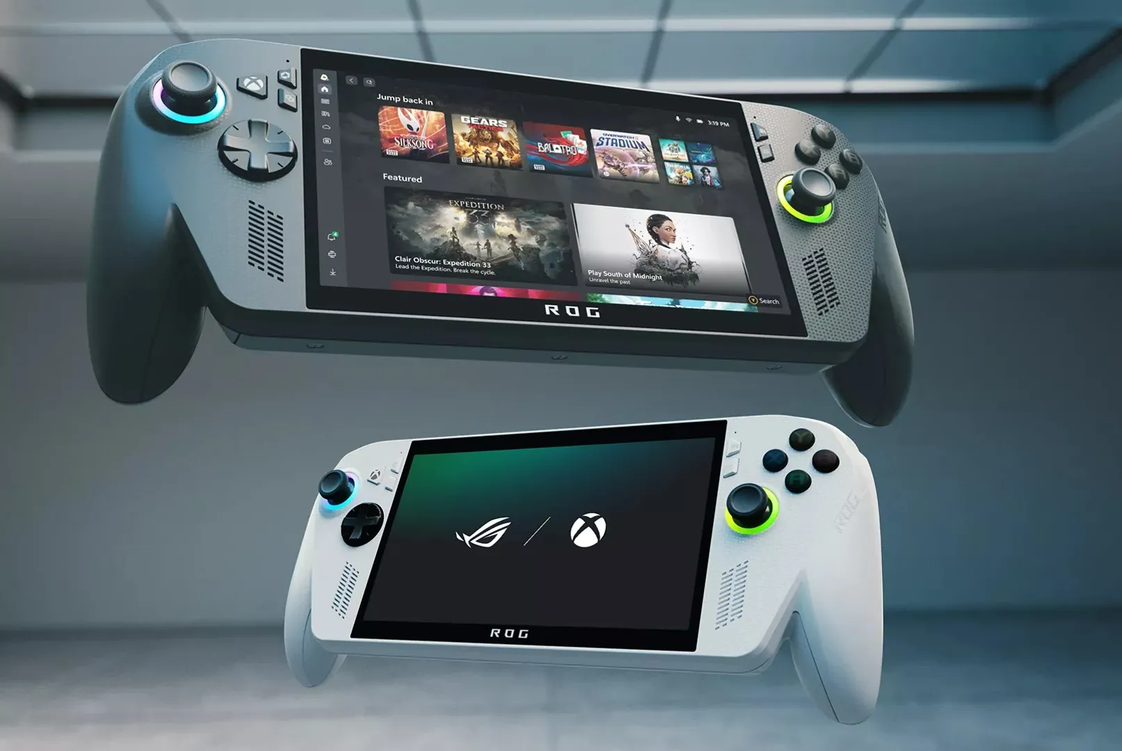
The larger aim is consistency. Xbox has often felt fragmented across console, PC, cloud, and handheld devices. Microsoft wants the interface to feel familiar no matter where you play, especially as it prepares for Project Helix and more hybrid Xbox hardware.
Here is a quick look at the visible changes:
| Area | What appears to be changing |
|---|---|
| Console dashboard | Fewer ad slots below the main carousel |
| Profile placement | User profile moved to the top right |
| Handheld UI | Similar to console, adjusted for smaller screens |
| Xbox PC app | Takes cues from Xbox Cloud Gaming |
| Friends display | Online friends shown in the left side column |
| Main goal | More consistent Xbox experience across devices |
These changes are not a full redesign, at least based on what has been shown so far. They look more like refinement. Still, the direction makes sense. If Xbox wants console, PC, handheld, and cloud gaming to feel connected, the software needs to feel unified too.
The reduction in ads may be the most noticeable improvement for many players. Xbox dashboards have often been criticized for feeling too busy, so even a small move toward a cleaner layout could make the experience feel better.
Microsoft has not announced when this refreshed dashboard will roll out. The designs also appear to be works in progress, so more changes may arrive before release.


Discussion (0)
Be the first to comment.