Have you ever wondered what fonts are? How about font families? Do you want to know more about font properties, font weight and font styles? In this guide, we answer all these questions (and more) and define the different little things that, together, make a font and a font family. Let's get started:
What is a font?
By definition, a font is a set of characters, usually letters, numbers, punctuation marks, and other symbols. Fonts are characterized by their size, weight, and style. Some fonts are larger than others, some are bolder or more italic than others.

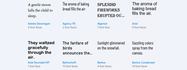
Fonts come in different shapes and sizes
All these characteristics apply to the fonts we use today, except we now usually use and see fonts displayed on screens of all kinds. Fonts used on computers, in web browsers, in office applications, or any other apps are still defined by the same characteristics: size, weight, and style.
Let's take these three main characteristics one by one and see what makes them significant. Everybody has probably heard about the Arial font, so we use it as an example.
What is font size?
Font size is usually measured in points which are often equivalent to pixels on computer displays and other types of screens. For instance, a 14 points Arial font means that the font you use is named Arial and that its characters (letters, numbers, and other symbols) have a maximum size, or height if you wish, of 14 points. A sentence written in 14 points Arial looks like this:
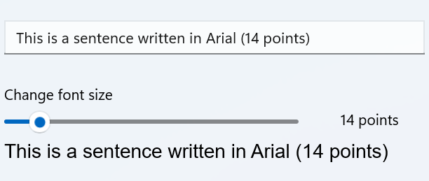
Font size is measured in points
What is the font weight?
Fonts are also characterized by weight. The weight of a font refers to how thick the characters it contains are, or more precisely how thick the lines (strokes) of the characters are. The usual types of font weight are regular, bold, and light. The default weight is regular; a font with a light weight means that its characters are thinner than its similar standard or regular font. Similarly, a bold font means that the characters are thicker than the regular form of that font.
A font can have other weights too, like lighter, semi-bold, or bolder. Sometimes, the font weight can be specified in numbers; for instance, a font can be 100 light or 600 bold. However, the regular computer user is going to deal with regular, standard font weights, and with bold weight fonts. Below, you can see an example of an Arial Bold font, alongside the regular Arial. It's clear which is the bold version.

The weight relates to stroke thickness
What is a font style?
The third essential characteristic of a font is its style. Fonts can be italic (or oblique), condensed (or narrow), compressed, extended (or expanded), and so on. For instance, the characters from an italic font have a distinct angle from vertical. The characters from a condensed or narrow font have a narrower spacing than the standard spacing between them, while an extended or expanded font has wider spacing between its characters. Here's an example of fonts with different styles:
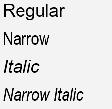
Text written using Arial Narrow and Arial Italic
In addition to the three main aspects that define it (size, weight, and style), a font is also characterized by other things like the design, the method through which their characters are represented (through dots or by using vectors), or their orientation. For instance, the Arabic fonts are designed for right-to-left reading instead of left-to-right, like the fonts used by most languages.
What is a font family?
A font family represents a collection of all the fonts that share the same design characteristics. The fonts belonging to the same family can vary in size, weight, and style, but share the same essential design characteristics.
For instance, when people think about Arial, they only think of one specific font face, but it’s actually a whole font family, characterized by the same straight lines and letter appearance. Think of it this way: a font family is the sum of all weights and styles of a particular font.
Fonts as files on your computer
Fonts are stored as files on computers running Windows and other operating systems. A font file contains details about the design, size, weight, and style, as well as the characters included. Just as executable files have the “.exe” extension in Windows, fonts have a few specific commonly-used extensions. The most common extensions for fonts are TTF and OTF.

File extensions for font files
TTF is an acronym for TrueType Fonts, a font format created by Apple and licensed freely to Microsoft in the 1980s. Because of that, this format is now the most widely used on Windows computers. You can find more details about this type of font files and a bit of history about it, here: TrueType.
OTF comes from OpenType Font. OpenType is also a child of Microsoft, but this time it came to fruition with the help of Adobe instead of Apple. OpenType fonts are used on Windows computers, as well as websites on the internet.
On Windows computers and devices, installed fonts are stored on your system partition - the one on which the operating system is installed - in the Fonts subfolder of the Windows folder. If you download a font, you can store it in any folder you want, but once you install it, a copy of the font is saved in the folder we mentioned.
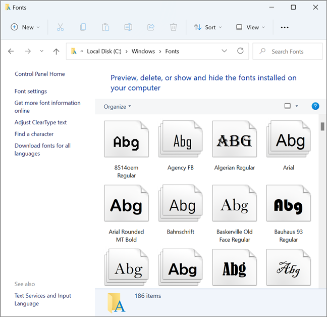
The location of installed fonts in Windows
If you want more details on how to work with fonts on a computer running Windows, here’s an article on How to view and install fonts in Windows 11 and Windows 10.
If you would like to find fonts on the internet and download them on your computer, here are 10 best locations where you can download safe free fonts.
Hard to read at low resolutions?
Reading fonts at low resolutions was a problem with the first fonts used on computer screens. Instead of smooth lines, the low resolution translated into hard to read characters. TrueType fonts have introduced a significant improvement using a technology called hinting. Later on, anti-aliasing was added and finally subpixel rendering. Microsoft implemented the latter under the name ClearType. ClearType can be turned on or off in Windows depending on user preferences.
Subpixel rendering takes advantage of the technology used in LCD screens. For every pixel on an LCD screen, there are three actual subpixels for each of the basic colors (red, green, blue). The color white is obtained by firing up all three pixels at maximum intensity. Subpixel rendering displays different information on each color subpixel, taking adjacency into account to smooth out the edges.
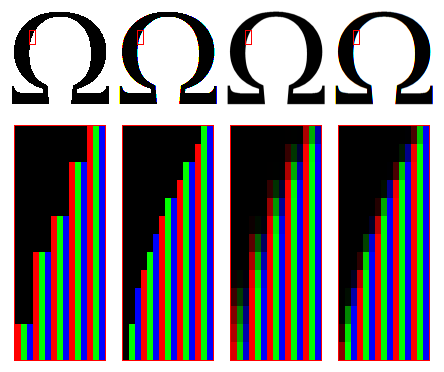
From left: no anti-aliasing, subpixel rendering, anti-aliasing, ClearType
Some people are bothered by this technology because the fonts appear to them colored instead of black. The effect is worsened if the screen background is not white. If you have this problem, you can turn off this feature in Windows.
A brief history of the font
Historically speaking, the word font, or fount, meant a set of different characters that were either carved from wood or shaped from molten metal in a mold. The first font probably appeared when the first printing technique was developed. That took place in East Asia, somewhere during 206 BC - 220 AD, when the Chinese started to use woodblock printing on cloth and paper. By the 11th century, East Asia had already seen the invention of moveable wooden type (one piece of type for each character), and by the 13th century, Korea had developed metal moving type. Chronologically, the next important step was the invention of mechanical moving type printing by Johannes Gutenberg in Europe, around 1450. It was the moment when Gutenberg hired a scribe to help him design and create the first Western World font. According to Wikipedia, it had 202 characters and it was used to print the first books in Europe. Not long after that, Gutenberg created a second font with 300 characters, which he used to create the first printed Bible in the world. It's known as the Gutenberg Bible, or the 42-line Bible, the Mazarin Bible or the B42. Regardless of the name it bears, it marks the start of the age of the printed book in Europe and generally in the Western World.
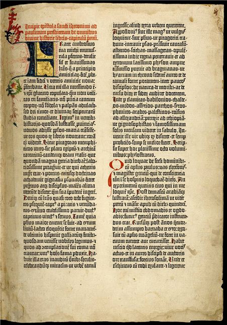
The font used in the Gutenberg Bible
Many different types of fonts were developed afterwards, but “the rise of the fonts” was during the 20th century when printing became an industry, and industrial printing machines became common. It was the age of widespread printed books and newspapers distribution, and it was a period in which many fonts were created.
Finally, starting from the last part of the 20th century, people shifted from reading on paper to reading on screens. Because of the rise of the internet, reading the news and finding written information, in general, has become increasingly popular on computers, tablets, smartphones, and other similar devices. People started to pay a lot more attention to what fonts look like when displayed on screens, so more designers than ever before started to create fonts. Thus, today, it's hard to know how many different fonts exist - estimates are in the region of 500,000 to 1,000,000.
What fonts do you prefer?
We hope that, in this article, we managed to shed some light on what fonts and font families are. Let us know which fonts you prefer to use. If you have any questions on this subject or if you want us to add other information to the article, don't hesitate to write to us in the comments below.


